Design for disability is assumed to be just wheelchairs and accessibility ramps, but the majority of people living in our society with diversities have invisible conditions. My final year project, 'Flo' focuses on designing for neurodiversity, considering how we can support people with neurodiversities and their ability to navigate the public environment.
Flo is a wayfinding service that assists in navigating exhibition spaces for visitors to the gallery. It provides guests to the space with the ability to curate their visit to their needs. Flo is needed because the curation of exhibition spaces are not considerate enough of the different sensory needs of neurodiverse individuals. It emphasises the welcoming atmosphere in gallery spaces to all, regardless of neurodiversities. It also enables visitors to trust in the space as they can limit the possibilities of undergoing stress or sensory overloads by personalised curated experiences.
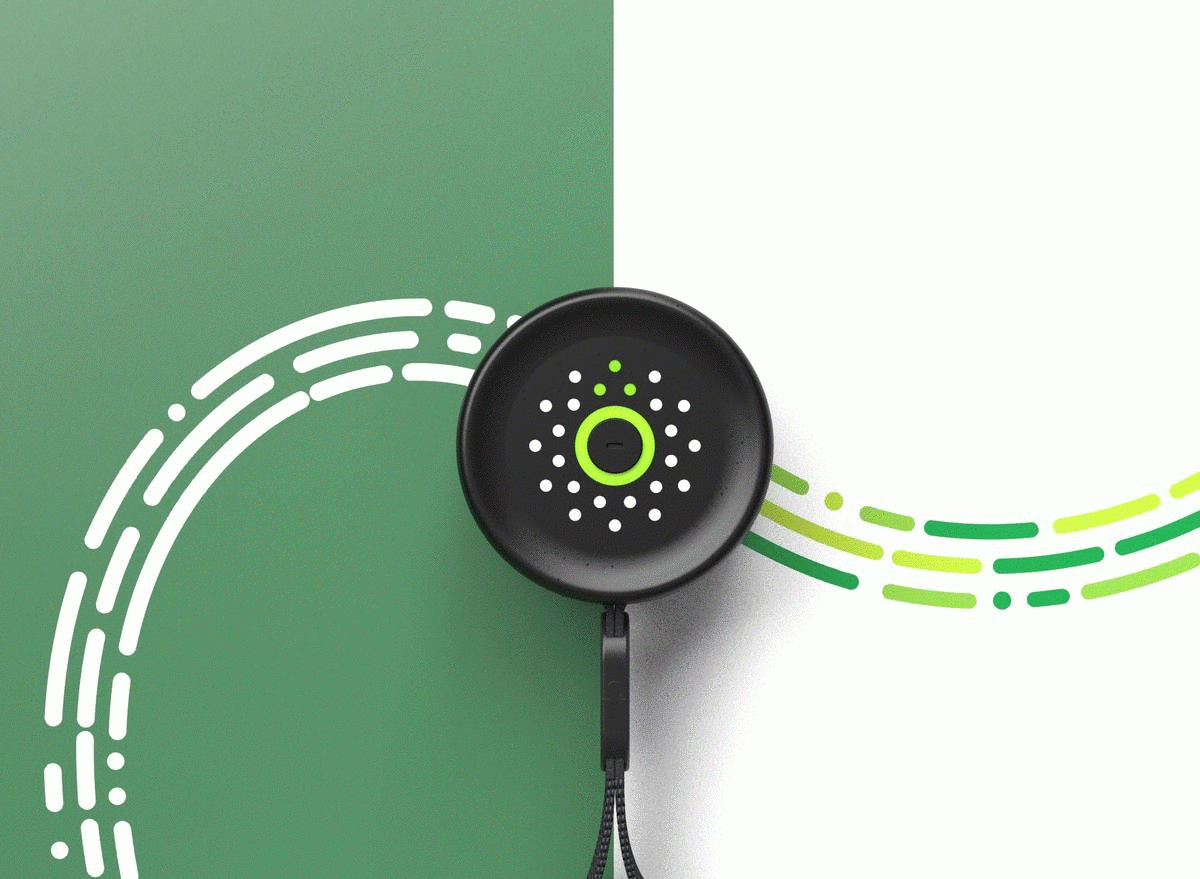
- Navigation Tool guiding a user through the green led arrow on the interface.
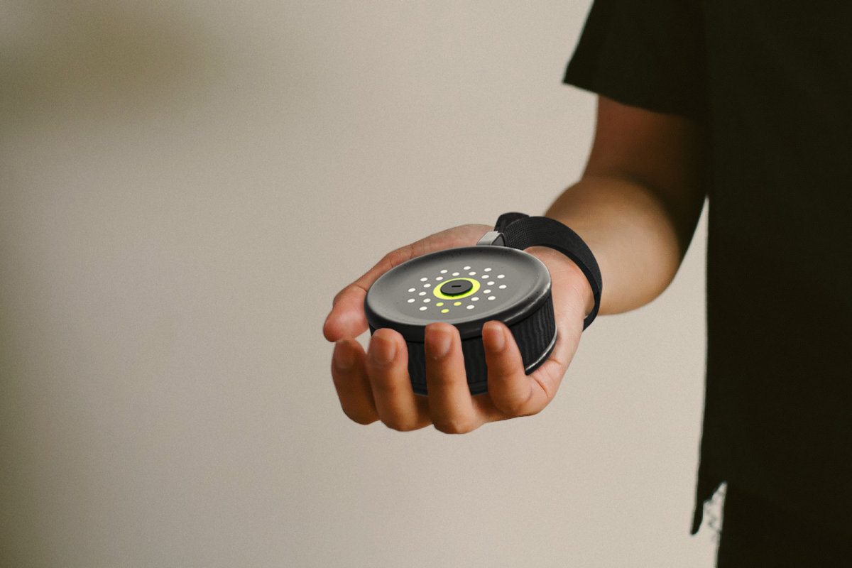
- Flo within the gallery space.
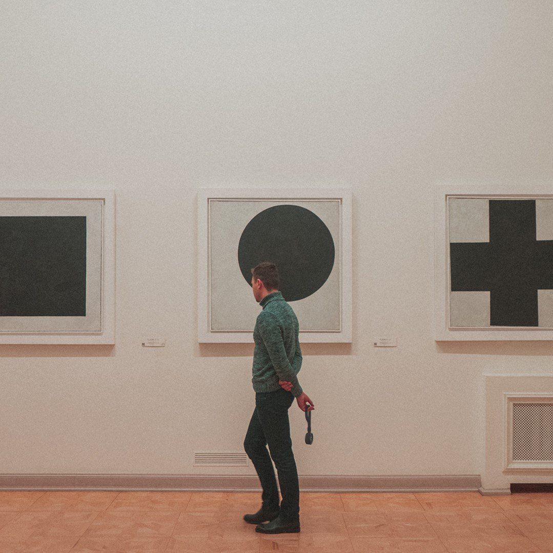
- The green arrow on the device rotates to guide the user as they move through the gallery.
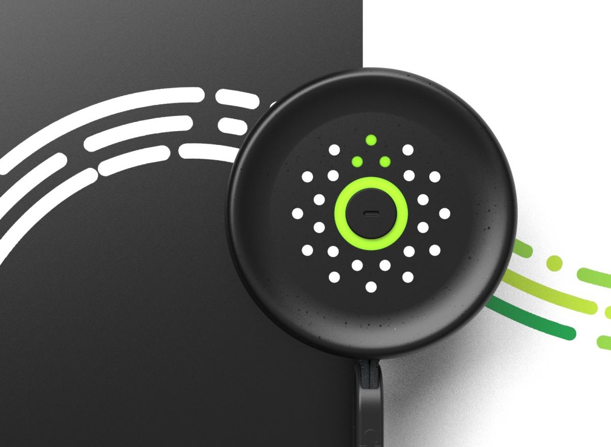
- Flo’s Navigation Tool.
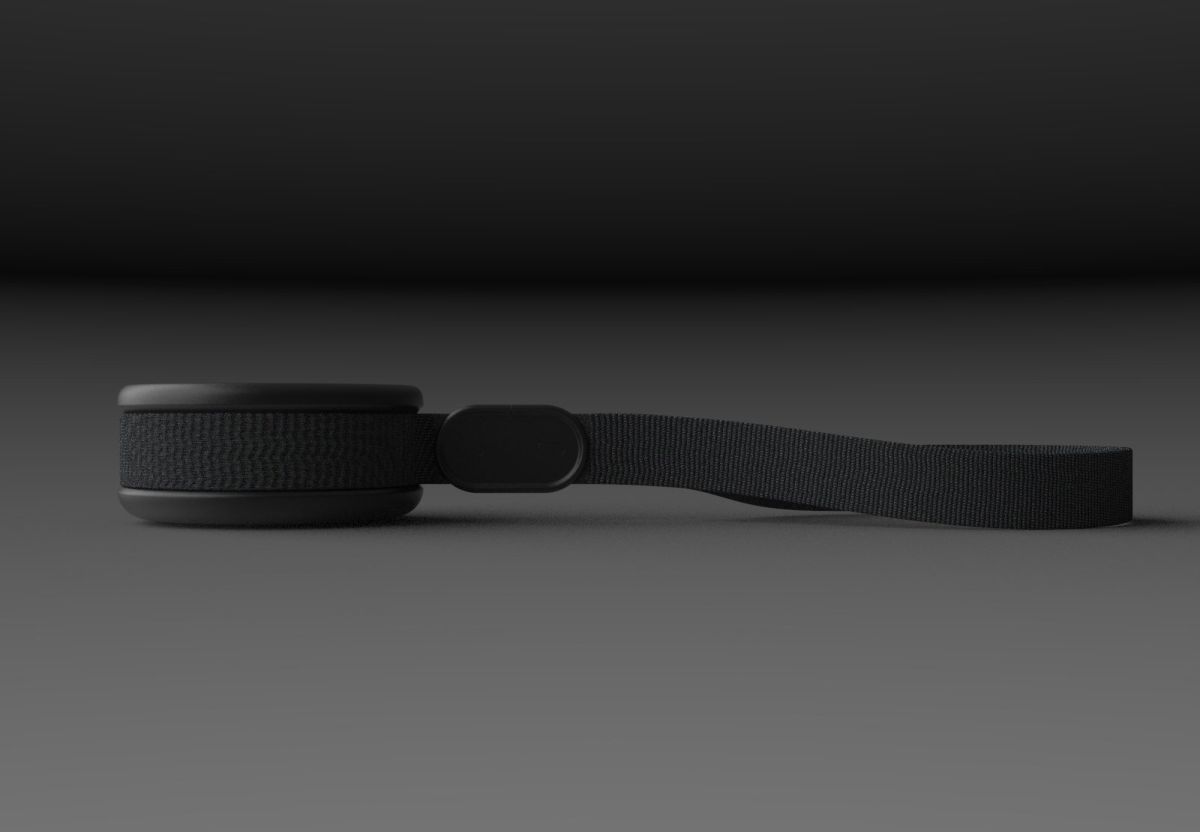
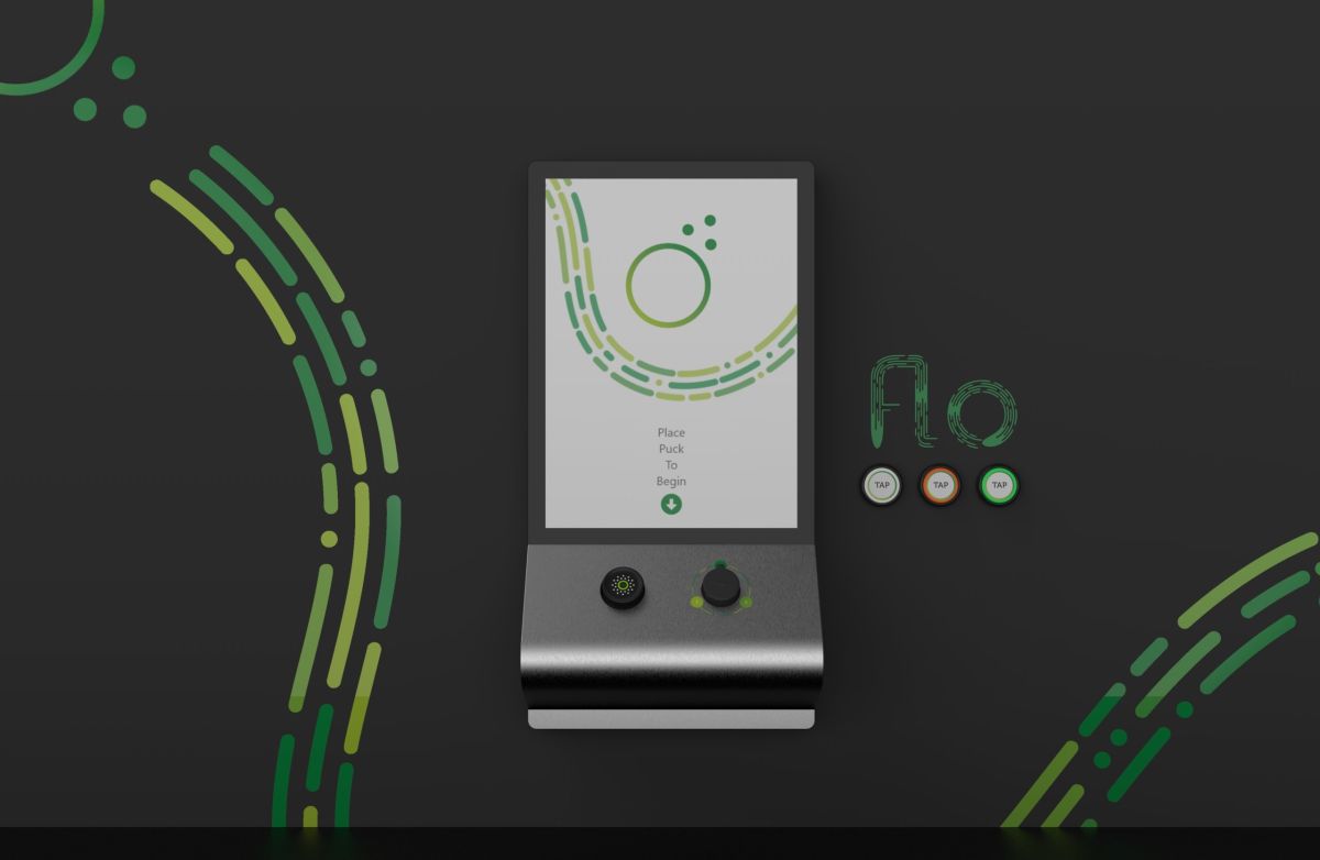
- Flo’s service includes a welcome kiosk at the beginning along with reassurance points located around the gallery.
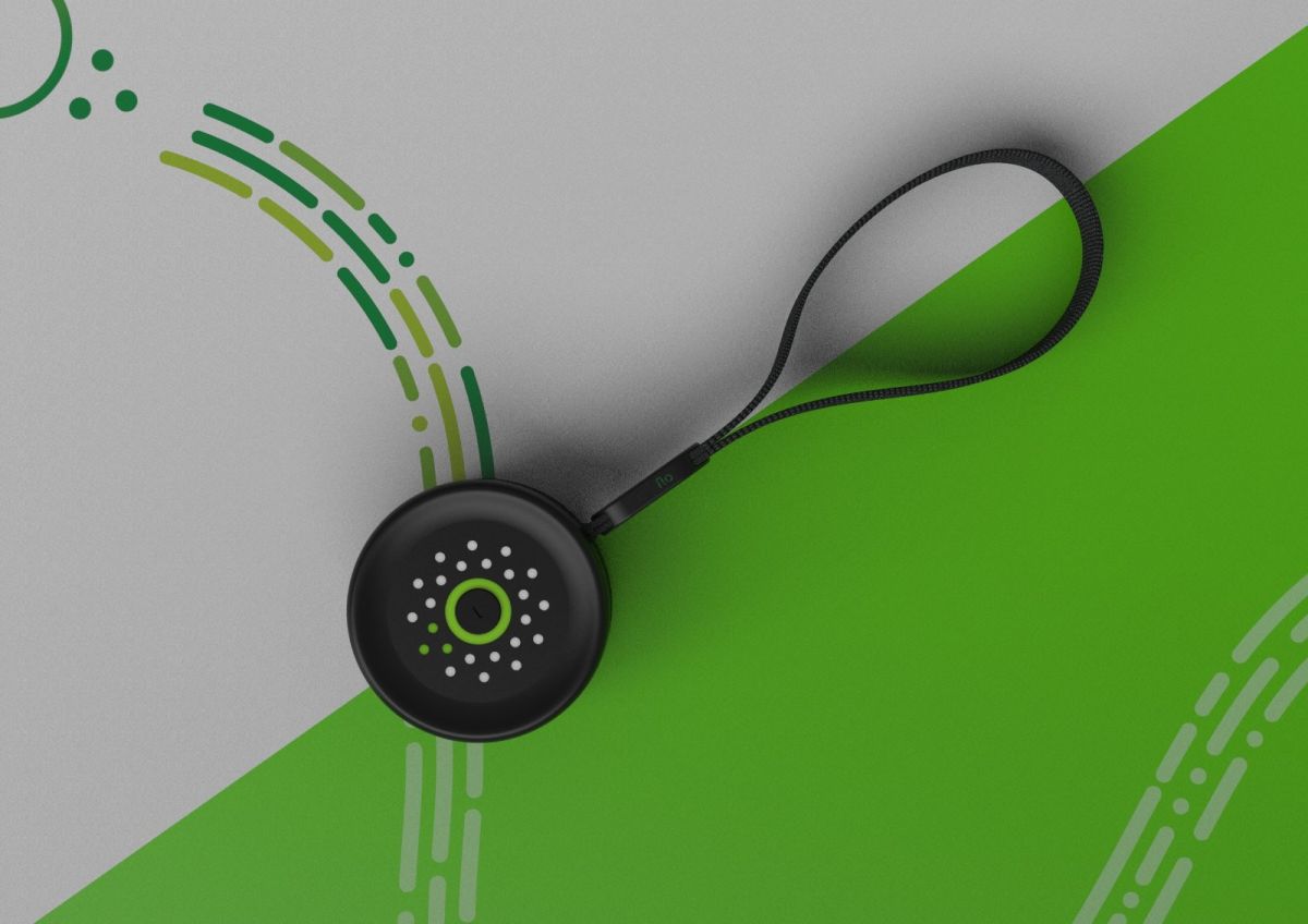
- Flo’s Navigation Tool.
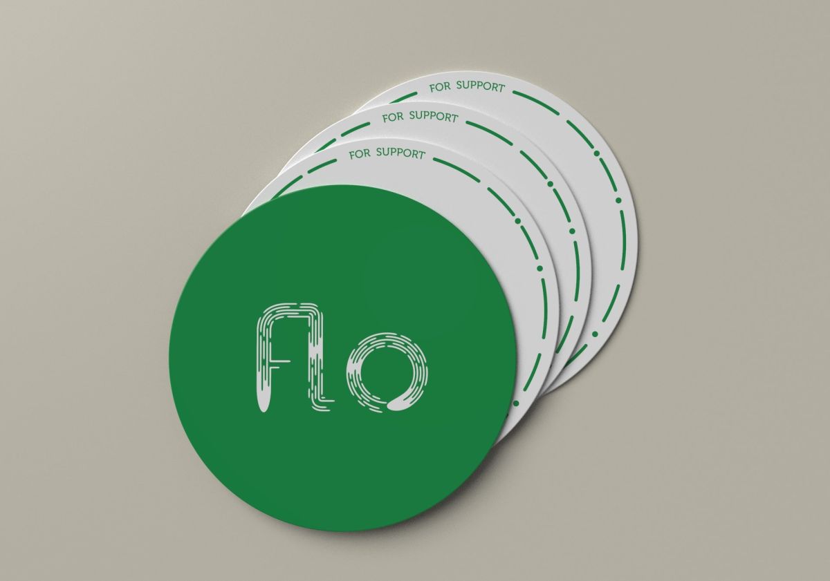
- Flo’s Packaging.
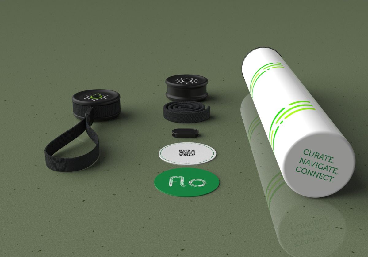
- Flo’s Packaging.
- An exploded view of the Navigation Tool and internal components.
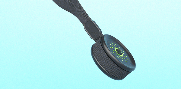
- Simple green arrow guiding a user. The device is meant to be as non-intrusive as possible so it doesn’t take away from the experience of viewing the art or installations.